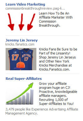
I was on Facebook earlier today and saw this ad block:
Now I am sure what order ads are displayed is somewhat random but how much higher do you think the click through rate of the knicks.fanatics.com link is with arrows on the ads above and below it pointing right to it?
For years people have used arrows in advertising to emphasize what the advertiser really wants you to see and here Fanatics got it for free. They didn’t have to waste any of their valuable ad space. These other advertisers did it for them!
Just thought this was kind of a cool coincidence that I would share. And yes, I did get sucked into starting a new site selling Jeremy Lin jerseys so that ad caught my eye even more. I knew I said I wasn’t gonna buy any new domains for a while but how could I pass up an opportunity to jump on the Jeremy Lin bandwagon?


That's hilarious!
Ha that's awesome! Wonder what they were thinking when they made this. Good work Wade! You made friends with the right video marketing company 😉
This is too funny, not sure what possessed them to build an ad like this, but my PPC team is glad they did.